

What Color WPC Panels Match Marble Floors?
Marble flooring is a true design statement, however when it is paired with the wrong wall material could instantly ruin the entire room. To keep a stylish and elegant look Wood-Plastic composite (WPC) panel walls are an unbreakable, long-lasting solution if you choose the appropriate hue. The most effective way to ensure an ideal match is the balance between temperature and contrast; because marble is naturally cool the walls you choose to use must match or be mindful of contrasts with the veining of stone. Let’s look at 2026’s most popular wpc wall panel colors to match perfectly with three marble types that are classic.
Table of Contents
Marble Floor Types & Matched WPC Panel Colors
| Marble Floor Type | Best Matching WPC Panel Colors | Suitable Application Style |
| White Carrara & Calacatta Marble | Black charcoal, gray slate light natural teak, and oak | Modern minimalist, Japandi style |
| Beige & Crema Marfil Marble | Deep walnut, pecans, roast matte cream off-white | Home and lobby of the hotel |
| Nero Marquina & Black Marble | Midnight black, micro-cement grey and metal trim | Industrial luxury, avant-garde commercial style |
Palette 1: White Carrara & Calacatta Marble (The Modern Minimalist-ish)
White marble, mostly Carrara and Calacatta, stays like a timeless go-to in upscale interior styling. It’s known for crisp white surfaces with cool gray veins or those bolder dramatic gold lines, and overall it gives a neat, high end vibe. But honestly, too much white may make the space feel clinical or cold.
Charcoal Black & Slate Gray: The High-Contrast Statement
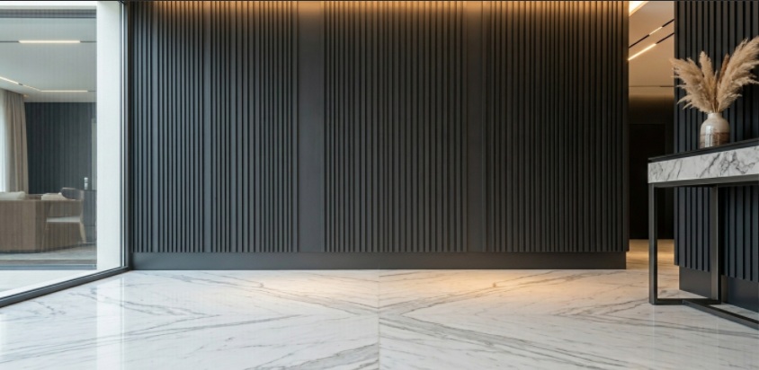
For feature walls, particularly behind the TV consoles and bed headboards dark WPC wall panel colors like dark slate gray or charcoal is suggested. This combo creates a striking visual contrast that helps anchor the space. The smooth, linear texture of contemporary WPC panels interrupts the sweeping impression of flat marble slabs and adds depth without obscuring the visual space.
Light Oak & Natural Teak: Add Japandi Warmth, quietly
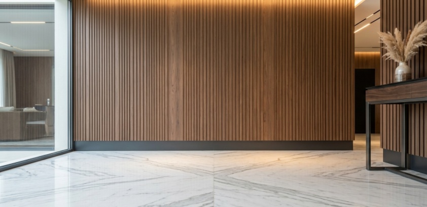
If you’re aiming for something cozy and more organic, then pairing white marble with light wood WPC tones feels like the most natural path. Together, they make the foundation of the very common “Japandi” style, like Japanese Scandinavian fusion, with calm lines and warm layers. The natural warmth from light oak kind of balances the icy undertone of white stone, and you land on that better sensory equilibrium, not too cold, not too heavy.
Palette 2: Beige & Crema Marfil Marble (The Warm Classic)
Beige marble, with Spain’s Crema Marfil being the industry benchmark, delivers an entirely different psychological effect than white stone. It radiates warmth, hospitality, and a sense of “Old Money” stability. It is widely specified in luxury residential living rooms and high-traffic hotel lobbies.
Deep Walnut & Roasted Pecan: Rich Sophistication
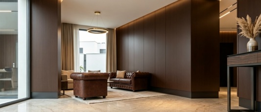
When you’re working with a warm-toned floor using a tone-on-tone gradient, it works perfectly. Picking a rich, dark brown wall panel hues like deep walnut moves the focus upwards and helps to ground the space. According to research provided by the International Interior Design Association (IIDA) geometric alignment with dark wood colors on surfaces boosts the perceived height of ceilings by as much as 12%.
Matte Off-White & Cream: Expansive Serenity
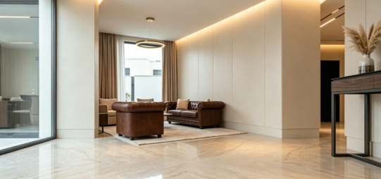
For smaller rooms or corridors, consistency is crucial. A beige marble that is matched together with an off-white, matte or cream WPC panel lets in light gently. This gives a light spacious, unified appearance that makes rooms feel like they’re twice the size.
Design Tips: Avoid pairing white marbles with WPC panels with intense orange or red underneath (such like bright cherry wood). The clashing undertones can distort the natural beauty of the stone and can make the appear outdated.
Palette 3: Nero Marquina & Black Marble (The Bold Avant-Garde)
Black marble, accentuated by sparkling white veins of calcite, is a high-stakes style. It’s dramatic, eerie and unquestionably extravagant. It is a must for wall pairings which either reflect its intensity or diminish its power.
Micro-Cement Gray: Industrial Luxury
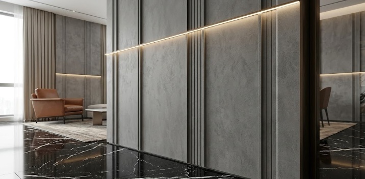
To avoid a room becoming a dark, sombre cave Medium-gray WPC wall panel colors -particularly ones that mimic the texture of micro-cement or raw concrete are very efficient. The texture that is matte that is present in the WPC panel softens light and softens the harsh reflections that bounce from polished marble flooring.
Charcoal-on Black with Metallic Accents
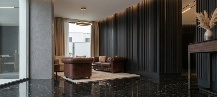
For commercial spaces that are avant-garde or luxury boutiques for retail or dark executive offices monochrome with a dark, black and white palette is the best choice. The combination of black marble and midnight-black fluted WPC panels results in a smooth seamless transition. To further enhance this look In 2026, specifiers are placing slim bronze or brass metallic profile strips within the WPC grooves to add subtle glints and luxurious.
2026 Core Material Trend: Why “Matte” & “Co-Extrusion” Matter
Achieving an elite color match is about more than just the color code; it depends heavily on the surface finish. A common mistake in budget renovations is purchasing high-gloss plastic-looking panels to place next to real stone. The artificial sheen of low-grade PVC panels creates a jarring material clash that ruins the authentic luxury of the stone.
To bridge the gap, modern interior architecture is based upon Co-Extrusion technology for WPC. Co-extruded panels have a 360-degree shield of protection which allows for real-looking, 3D wood grain embossing as well as ultra-matte surfaces. This technology blocks plastic glare completely, ensuring that your walls feel and look like real, premium wood and can be proudly displayed alongside natural stone, regardless of the wall panel colors you select.
Premium WPC Solutions for Elite Environments
If you are managing the most luxurious residential or commercial projects, selecting materials that meet high-quality standards is essential. The engineering lines of the world at WPC Decorative Wall Panels directly responds to these complicated architectural and aesthetic demands.
- The ability to match custom colors is a major benefit. As natural marble colors vary dependent on the quarry’s batch, a standard color is rarely successful. Chongqing Huigong offers bespoke color-matching and custom extrusion profiles to ensure that the colors blend perfectly.
- Commercial-Grade Performance: In addition to appearance, the panels come with class-B fire resistance, total waterproofing of moisture (making them suitable for high humidity marble bathrooms) and have zero VOC emissions, which makes them perfect in green certifications for buildings.
Elevate Your Next Design
The art of balancing the interaction between walls and floor is a matter of determining the ways in which reflection of light, and textures interact.So whether you decide to frame white Carrara marble with bold charcoal fluted panels or lean into the softer glow of Crema Marfil alongside deep walnut accents, the point is still the same, create a single unified material narrative with the best wpc wall panel colors.
Want to level up your next project with a true architectural-grade finish? Take a look at the Chongqing Huigong WPC Wall Panel, or contact our team to grab free color samples for your material board today.